How to handle contrast
Earlier today, I was explaining a couple concepts dealing with contrast in b&w film development in a group of camera people, and about halfway I thought, ok, this is where I initiate nerd level “off the scale”. But apparently, I struck a chord with some readers.
So you know what? Let’s take it to here, and do a little writeup.
You’ve been warned.
Subject contrast
The subject contrast is where it all starts. This is the contrast (the difference between the highlights and the deep shadows) of the scene you want to photograph. This can be anything from “a few stops” in a still life in subdued light to “an insurmountable, headache-inducing contrast on a bright sunny day at 11 o’clock in the morning shooting into the light.”
While there are pictures like that which work well, and if it’s what you want, go ahead… but there are cases where it pays off to keep your contrast in check.
There is only so much contrast a film (ANY film) or digital camera can process without losing detail at either side of the scale. Exceed what the film can capture without the highlights washing out, or the deep shadows losing all detail and turning into a murky void, and that’s it. Again, fine if that is what you’re going for, but for those times you don’t, you would need to figure out how.
“But… but but but you make it sound like some dark art, with a lot of theory to it… why can’t I just set my camera to P and be done with it?”
A word of warning, then: this article may not be for you. Which is fine! If your pictures make you happy, more power to you. I wrote this article series for my fellow OCD control freaks, who want to understand the underlying theory of how to manually control the process of creating images, rather than farming it out to artificial intelligence.
On dynamic range, exposure latitude, and curves
The ability of your imaging medium (this may be a film/developer combination, or a digital camera sensor) to span a subject contrast range is called the “dynamic range”. It is usually expressed in stops (“5 stops” meaning, if your brightest highlight is 125/f16, and your deepest shadows would measure at 125/f4, you’d have detail in all areas of the negative if your medium’s dynamic range would be 5 stops or greater).
Of course, this would require more detailed metering than what your camera will normally do, but that’s a subject for a different article.
It’s often also called “latitude”, but that’s not exactly the same, although they are related. This is where curves come in. The curve of a medium tells us what middle grey will look like on the picture, how dark the deep shadows will be where you can still see detail, and how the film manages to retain highlight detail (something in which negative film is pretty good, conceptually better than digital). Kodak Tri-X is an example of a film that has pretty contrasty curves, and yet manages to wring out highlight details in very bright skies that other films have long called “out of scope”. Latitude tells us how a film reacts to over- or underexposure.
Image contrast
If your subject contrast of a scene in the real world is six stops, there is no way you are ever going to get the brightest part in the negative 32 times as bright, let alone in the print.
“Wait… thirty two? Where did that come from?”
Well, that’s two to the power of five for you. We’ll get into that when we’re going to talk about exposure and light metering, which is food for a different article. Each stop doubles the EV (exposure value), so f5.6 is for when the light twice as bright as f4, f8 is twice as bright as f5.6, f11 twice as bright as f8, and f16 twice as bright as f11. So, that’s 2 to the power of five, or 32. Your emulsion cannot do that. It can capture it, but the bright parts (which are the dark parts when you print it) will not be 32 x as translucent as the dark parts (which, on inversion, become the bright parts of the image).
So, in order to retain all that information, your medium must compress the contrast. The overall maximum subject contrast is the dynamic range, and the distribution of the clarity values throughout the entire range is represented by the curve (some mediums will make middle grey show up darker than other mediums).

And then, if you’re going to print that picture, the plot thickens further, as a sheet of paper can show even less image contrast than a negative. A piece of paper only reflects light, whereas a screen can emit light on its own. So while showing a picture on screen (or projecting a slide) can be pretty contrasty, a print’s contrast is even lower.
OK, back to our medium.
What are we looking at in terms of dynamic range and latitude?
B&W (traditional and C41)
In general, black & white negatives will offer a greater dynamic range (read: capacity to compress contrast) than colour media. Colour rendition does introduce extra complexity into the process.
C41 colour
Colour negatives also show a decent dynamic range — better than transparencies. There is a logic to that, which we’ll get to further down.
Digital
Digital is a different kettle of fish, but…
Transparencies
… transparencies are very much fish from the same kettle as digital when it comes to how they deal with highlights and shadows! Different fish, but from the same kettle.
“How so?”
In both cases, there is no intermediary “negative” stage of the picture. Since most of the picture is formed (and in development, earlier during the process) in the area where a lot of light hits our medium… in digital and transparencies, that’s the highlights, which, on the transparency medium, are close to transparent, whereas on a negative, the highlights are the darkest (densest) part of the negative, and the shadows contain very little information – they are close to translucent.
Conceptually, a digital sensor and a transparency film are at the bottom end of the dynamic range game, but clever design and nifty software tricks have given digital an edge here. Transparency films like Fuji Velvia and Ektachrome are hard to work with; they have brought auto-exposure cameras to tears… they need to be exposed carefully, or they’ll just be… wrong.
Sensitivity
In general, the higher the sensitivity of a film, the wider is the potential dynamic range. So an ISO400 film offers more headroom than an ISO50 film.
Negatives: expose for the deep shadows
Because of the abovementioned difference between negative film on one hand, and digital and transparencies on the other, the exposure method should be different. Again, this is a subject for a different article, but remember this: with negatives, if you need to expose them carefully, you do a measurement of ONLY the darkest part of the picture that you want to see detail in, and you underexpose from there to get at middle gray. Most negative films have no problem rendering highlight details (the dark bits on the negative); you need to seriously overexpose to screw that up.
Transparency and digital: expose for the highlights
Here, the area containing the least information are the highlights. So, here we do a detailed measurement of only the brightest highlights that we want to have detail, and we overexpose two stops from there.
Yes, I specifically say “two stops”, whereas, with negative, I did not mention a number. That’s because your mileage may vary, and probably will — if we get it right, to our advantage when shooting negative film.
Mind you, this is traditional digital, without HDR and other trickery; that’s an area where I’m not gonna go, as it is way too camera- and software-specific.
Black & white negative pushing/pulling
Underexposure and overdevelopment (pushing)
Result: contrast compression decreases, so contrast remains relatively high.
Pushing refers to “pushing the sensitivity up” — exposing the film as if it has a higher sensitivity than ‘box speed’ (the ISO value on the box). For instance, exposing an ISO400 film as if it were an ISO800 film.

This would lead to underexposed photos, so we’re going to compensate for this by lengthening our development process. Because development (activating the silver halide to form the image) is not a linear process, the parts of the image that received the most light gets all the time it needs to “black out”, while waiting for the dark parts of the photo (the more translucent bits of the negative) to start showing at least some details — causing the difference between dark and light to increase.
Overexposure and underdevelopment (pulling): compression increases
Result: contrast compression increases, so contrast is lowered and dynamic range gets greater
With pulling, we’re going to play the other way ’round. We overexpose, and then shorten the development cycle. Because we have overcooked on exposure, the deep shadows will develop sooner than we thought… so before the highlights (remember, those are the dark bits on the negative) are properly developed, we stop development. Thereby, the darker bits get a bit brighter, and the bright bits get a bit less bright, and we have effectively increased our dynamic range.
The role of film developer
We’ve been concentrating on emulsions up to here, but our developer plays at least as important a role. In principle, virtually all developers reduce contrast (we call those “compensating developers”). After all, we need to reduce at least a sixteenfold, but most likely a thirty-two fold contrast range down to the tenfold or so that a negative will encompass. But some developers reduce contrast more than others. I am, unfortunately, not familiar with most of today’s recipes, but there are quite a few that are based on classic developers (ADOX has a modern (improved) recipe that behaves almost exactly like Rodinal (which has been around for… what? 130 years?), and similar alternatives for XTOL (which dates back to the early years of this millennium) and Neofin Red. In general, the last one (called ADOX FX 39 II) is, in its higher dilutions and correspondingly lengthened development times, combined with overexposing the film, reputed to be well-suited to capturing subject contrast ranges that would normally fall outside what a film can do.
I have not worked with it yet, but I’ve acquired a bottle of this stuff to play around with.
Special development techniques
If you really want to pull all the stops on tweaking the process, there are other techniques available.
I have, in the past, had some excellent results from a technique called “stand development”, in which you work with almost homeopathic solutions, very long development times, and (contrary to the regular development process) very little agitation. I had a serious challenge, where the subject contrast was rather extreme — an unlit factory hall, which had a sliding door straight into the sun on a harshly bright early summer day. But I also wanted to show details at the dark end of the hall. I went to town with a handheld spotmeter to quantify the challenge I had at hand. I don’t have my notes anymore, but I seem to remember the contrast range was 13 stops. But I really really wanted that photo, so I decided to throw everything I had to it.
I had a Fuji Neopan 400 NPH, which I exposed at ISO200.
I had ordered myself a batch of Amaloco Nivenool, a developer known for being very good at compensating. I diluted it to 1:20 instead of 1:4, put the film in, agitated for 30 seconds… and then let it sit there for 50 minutes, not touching it. Essentially, this starves the developer in the areas where the highlights were strongest (remember, that’s the dark bit on the negative). while the developer near the shadows can take all the time to do its work.
The result? Better than I expected.
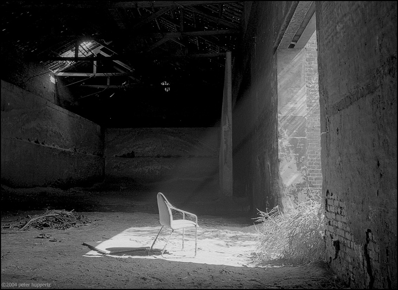
I entered that photo into a competition I had made it for. A couple other contestants, including professionals, also visited the site (the abandoned Carcokes factory in Zeebrugge, before it was demolished). They were gobsmacked to see the result. That photo didn’t just win the contest, it blew everything else out of the water (mind you, the contestants’ votes determined the result, and I think the picture below got over 50% of the votes).
Having said all that, Amaloco is out of business, and Nivenool no longer exists, so if I would need to do that again, I’d be back to square one.
Caveat: C41 negatives and E6 transparencies and pushing
By now, you may be under the impression that traditional film development is a dark art, with many variables (development time, dilution, temperature, the phase of the moon).
Well, you know what? You’re right.
This is exactly what makes it fun. The more you learn about it, the more you find out how many knobs there are that you can twiddle to make the outcome be the one you desire.
In order to prevent this, the industry came up with some process and materials standardisation to take the fun out of it.
I’m joking — a bit. What the industry wanted was a simple, repeatable, fully documented, consistent process — which resulted in C41 for negatives (primarily colour, but there are also C41 black & white films) and E6 for transparency films.
The nature of a standardised process is it was never designed for promoting creativity in the development process — on the contrary. The best labs are the labs that produce the most consistent results.
Kodak’s stance on pushing, most notably on pushing C41, was “we think it’s a bad idea”.
Others have different opinions, and the debates on this can be rather vitriolic. I’ve seen people go at each other’s throats on the internet when this subject came up, so I’m not going there.
What I will say is:
Pushing or pulling C41 will lead to colour shifts. Whether or not you like that (and whether it’s the colour shift you’re aiming for and not some sort of angry fruit salad, or a yellowish shade of vomit) is anybody’s guess.
I will also say that I’m not trying to venture into that direction anymore. If that makes me less… adventurous, so be it.
2 Pingbacks